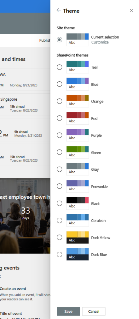
SharePoint: New site theme options
While engaging with SharePoint, I happened upon a discovery that caught my attention. Within the Change the Look menu, I stumbled upon two novel themes. Dubbed as Black and Cerulean, these newly introduced themes provide fresh avenues for customizing the visual identity of your SharePoint sites.
Black, an alluring dark theme, employs a palette of black, gray, and white to craft a suave and sophisticated aesthetic. It caters to sites aspiring to exude a professional and refined ambiance. Moreover, Black serves the purpose of mitigating ocular strain and amplifying contrast, a boon for users operating in dimly lit surroundings.
On the other hand, Cerulean boasts a luminous theme, harnessing hues of blue, green, and white to yield a serene and invigorating semblance. Ideal for sites seeking to radiate an aura of expansiveness and inventiveness. In addition, Cerulean bolsters legibility and inclusivity for users laboring in brightly lit settings.
- On your site, click Settings and then click Change the Look > Theme
- Under the “Personalize your background” setting, select the Picture option.
- Click the Browse photos button and select the background image that matches the theme you want to use. For example, if you want to use the Black theme, select the image named “Black.jpg”.
- Click the Choose picture button.
- Under the “Choose a color” setting, select the color palette that matches the theme you want to use. For example, if you want to use the Black theme, select the palette named “Black”.
- Click the Save button to apply the theme to your site.

Here is a screenshot of how the Black theme looks like:

And here is a screenshot of how the Cerulean theme looks like:

By using these themes, you can enhance your site customization options and make your sites look more attractive and engaging.
